Check out why we wrote the software to investigate Cord Ministries donations.
Since a model is only as good as the data we chose to use the actual giving data for 2017 to investigate different methods for calculating the Cord Ministries administrative charges for our people and projects.
Looking at the actual 2017 giving data in multiple ways is important to help people that are not statisticians get a handle on the facts. Having lots of slider bars gives the investigator the ability to focus in on the data and models in an intuitive way.

The Histogram Tab is an interactive way to see the relationships between the number of donations and the size of the donation.

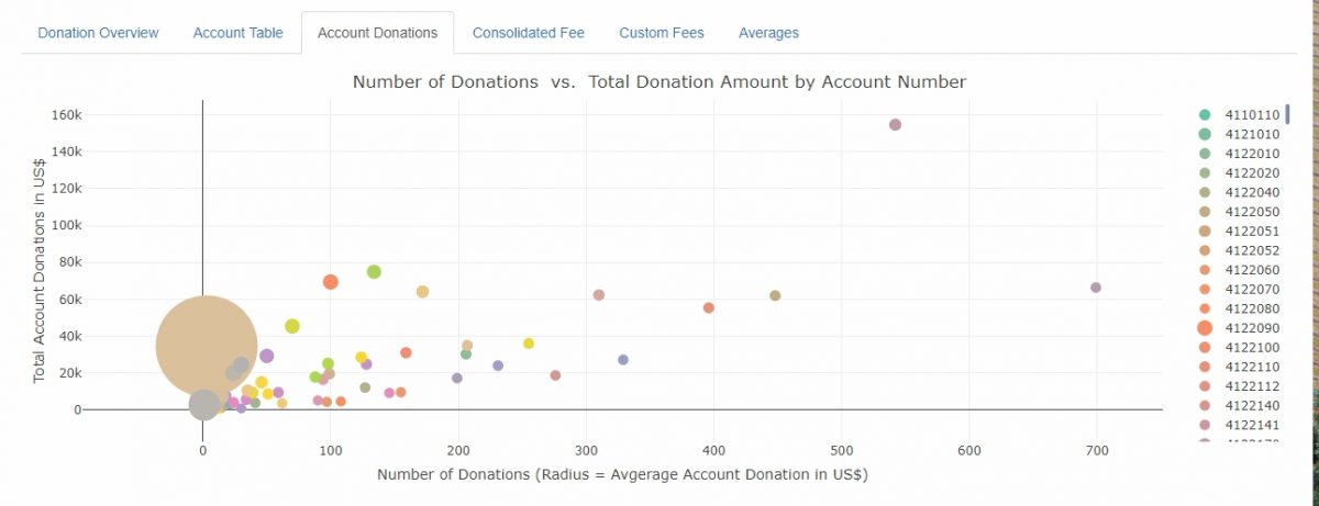
The Account Table and Account Donation Tabs have all the details of the year’s donations and the their designations. The 3D graph shows the same information; number of donations, total donations, and frequency of donations – all in fancy color.
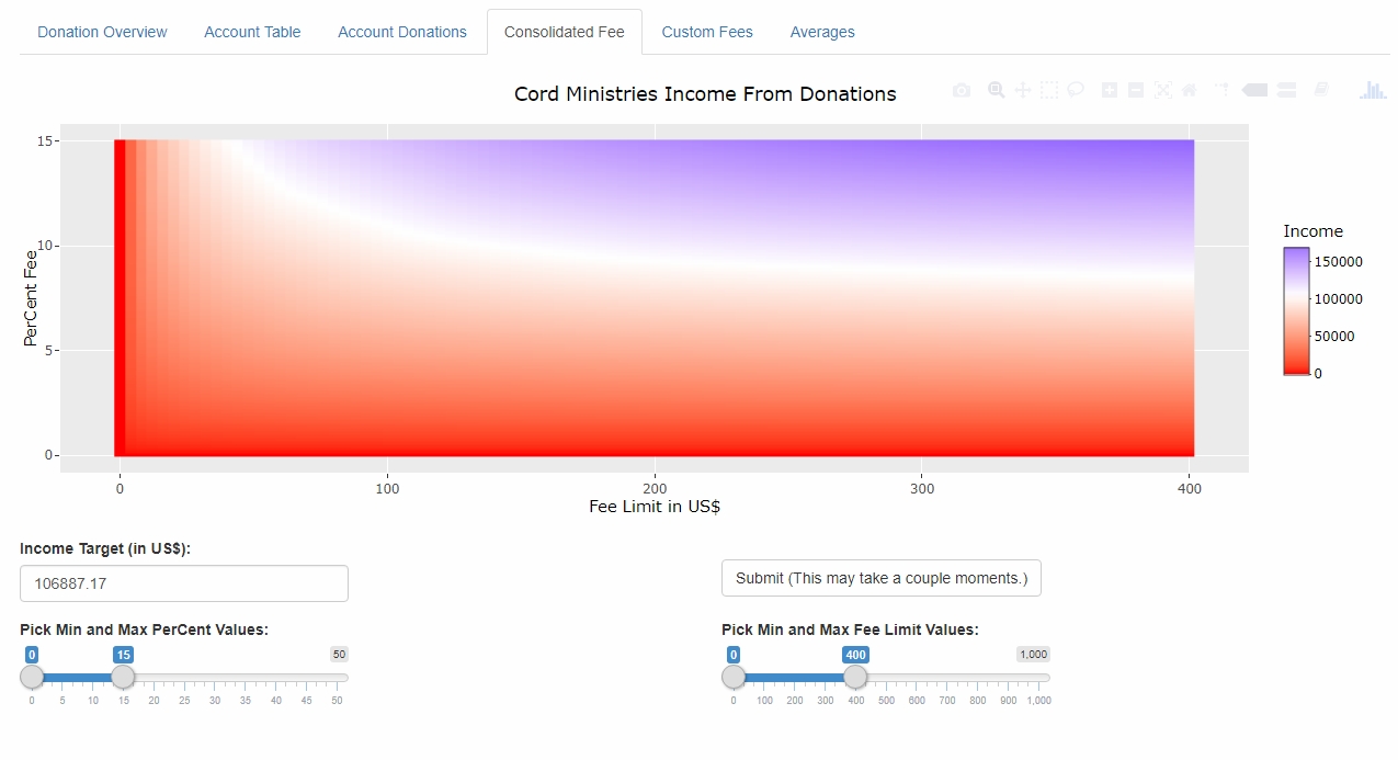
The Consolidated Fees Tab is where the modeling really happens. The future is clear, one consolidated percentage for both people and projects. Each year we specifically look into what that percentage should be. There is a lot of history, tradition, and expectations to manage but what is the “revenue-neutral” percentage and cap to use? Behind the scenes each pixel of color is the entire 2017 giving history investigated at the percentage and cap coordinate – that is 100 * 100 = 10,000 times through the year’s donations!
The Custom Fees Tab provides an interactive method to investigate individual percentages and caps. Each of the three different donation categories can be independently controlled to get a feel for the implications of each choice.
The final Averages Tab allows the investigator to simultaneously compare the averages of different donation ranges.
Please contact me if you would like to see the interactive model at work.